
Welcome
A brand identity is a vital element in communicating a company’s market differentiation and brand values. It is definitely the most visible element, and as such, should be treated with care and consistency.
This identity manual sets out fundamental rules and guides to help create and maintain a strong, recognizable and meaningful brand. Used properly, it will allow the brand to continually reinforce the company’s vision, mission and core values while attracting the target audience.
You want your brand to live in the hearts and minds of prospects and customers. Use this manual judiciously, and you’ll be well on your way to making that happen.
Brand Identity
Logo
The logo is the visual representation of an organization and is the most important carrier of the identity. Therefore, it is critical to use the logo consistently and with consideration for the image it projects. The logo should be used to unify and
strengthen all internal and external communications.
The logo is distinct and its forms have been carefully considered. This is why they may not be altered in any way. Using the logo incorrectly undermines the brand and causes inconsistencies with your image. It is therefore very important that this manual be followed carefully.
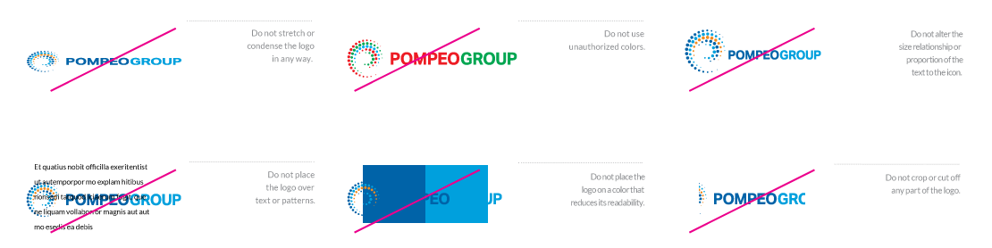
Unacceptable Usage
The logo should never be used in the following ways:
Tagline
The tagline represents the cornerstone of the brand and is second only to the logo in importance. Therefore, it is imperative to use the tagline consistently.
The tagline, and its placement in all of its forms, have been carefully considered. It should not be altered in any way. Additionally, you should always consider using the tagline with the logo in all communications whenever possible.
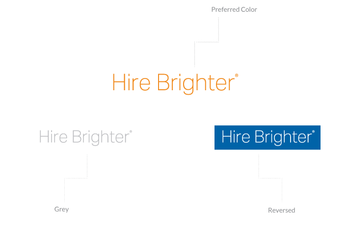
On certain occasions the tagline can be used separately from the logo as a design element, such as when it’s used on the same piece of collateral.
Support Element
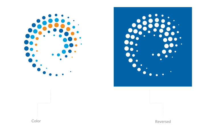
The Pompeo Group‘s icon mark can be used separately from the logo on certain occasions as a design element.
Clear Space Requirements
Clear space gives the eye a place to rest and also helps direct the eye to what we want to be seen.
A minimum amount of clear space must be maintained around the logo at all times to ensure its visibility and protect its integrity. The clear space differentiates the logo from all other elements on a page including all text, graphics, photographs and the edge of a page, which must be kept outside the clear space.
A simple rule for determining the appropriate amount of clear space is the Height of the S. The Height of S Rule is based on the height of the S letter in the logo. Simply measure the height of the S to determine the minimum amount of clear space that should surround the logo.
The Height of S Rule is applicable for a logo of any size. Additionally, the clear space may be greater than the height of the S, but never less.
When the tagline is used separately, the Height of C x 2 Rule applies. Measure the height of the letter “C” and multiply by 2 to determine the minimum amount of clear space that should surround the tagline.
Color
Logo Colors
Logo colors are an incredibly integral part of the brand identity. Using the colors consistently enhances brand recognition and strengthens value.
Utilize the supplied color samples and their standards to specify the colors when using an outside source for reproduction to ensure a color match.
In special applications where a unique result is desired, the logo may be blind embossed, etched or engraved in the color of the carrier material.

Color Palette
The palette represents the spectrum of acceptable brand identity colors and should be used for all types of media. The primary palette represents the colors that should be used the most and the secondary palette represents the colors that should be used as accents. No other colors should ever be used.
Typography
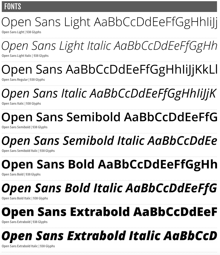
The typeface selected for Pompeo Group helps create a consistent and recognizable brand presence in all communications. Open Sans should be used on all internal and external applications including all printed communications, digital presentations, signage, promotions and merchandise.
For email and applications in which Open Sans is not available, it may be substituted with Helvetica or Arial.
In most cases, the variations in the Open Sans family of typefaces offers a lot of flexibility. However, using more than two or three variations in one document is not recommended. For the best results, follow these simple rules:
- For running text use Open Sans Regular.
- For bold text use Open Sans Bold or Extra Bold.
- For captions use Open Sans Italic or Light Italic.
Brand Assets
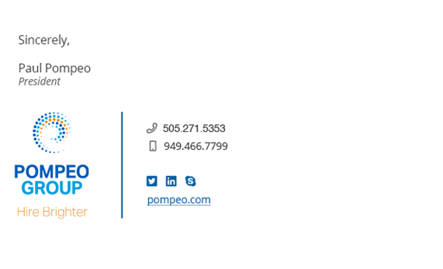
Email Signatures
An email signature template has been created to ensure brand consistency and quality of electronic communications.
All employees should use their signature in all email communications.
Business Cards
Business cards often provide a first impression as well as a lasting impression. The front and back layouts of the business card must be followed consistently. The size of the business cards is 2 x 3.5”.
Request Business Cards
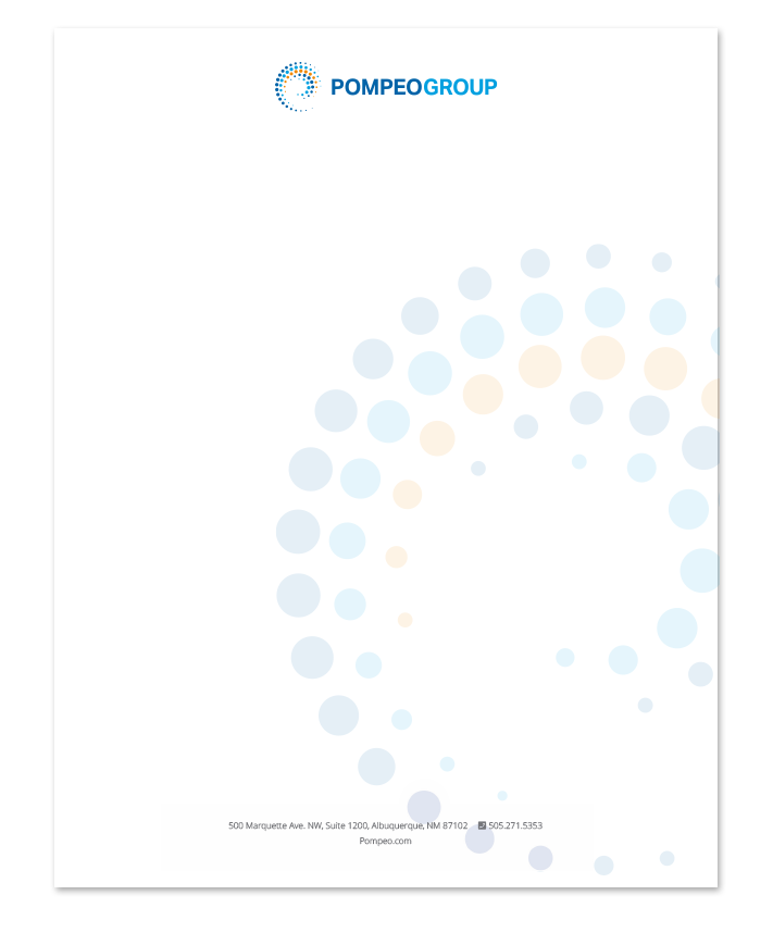
Letterhead
Letterhead is a projection of brand image and brand identity in written communications. The layout, typeface and logo usage for the letterhead should be followed exactly.
Letterhead should be printed by a professional printer and only be used for the first page. Successive pages should be on plain white paper.
For formal, mailed communications use pre-printed envelopes. For less formal mailed communications, a plain envelope can be used with a printed return address label.
Request Letterhead
Files
A variety of file formats for the material covered here are provided. This is a quick list of what each file format means, and where they would best be used.
Brand Identity Graphics
.ai format is the “raw” format and will likely never be used internally.
.eps format is a standard logo format and is ideal for printers and other professional uses.
.jpg format is lower quality but will work well for internal use with Microsoft office software.
.png format is similar to .jpg except it has a transparent background and not all applications recognize it. This format is ideal when placing the logo on top of color.
Brand Asset Graphics
.idml and .indd formats are the “raw” format and will most likely be used by a printer or designer.
.pdf format is used to present documents in a manner independent of application software, hardware and operating systems. It is not editable.